Mobile search now amounts to almost 60 percent of web traffic and mobile devices are more commonly used for all sorts of actions than any other device. Once the digital world has shifted the focus from the desktop to mobile devices, web designers, online marketing agencies, search engine algorithms and digital marketers invariably have come to know the dominant position of mobile in every aspect of the Internet.
Together with the complete domination of the mobile, user experience on these devices has become the main target because it goes beyond just creating a pleasant visual aspect. It corresponds to several aspects such as functionality across multiple devices, optimum loading speed, ease of accessing content on mobile devices and other things.
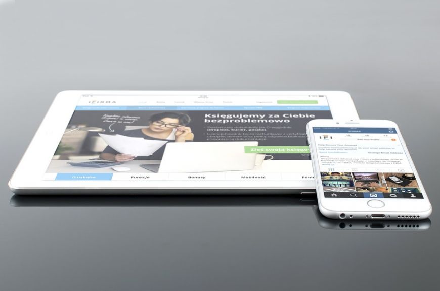
So, website optimization for mobile basically depends on how your website can make content and functions easily accessible, besides creating a visually pleasant aspect for mobile devices. Do you design your website to make it just right for mobile or mobile-friendly? Now it’s the time to tell you the difference between these two approaches, as an experienced online advertising agency.
In the most recent search algorithm update, Google has made it clear that the ability of a website to be mobile-friendly will occupy a crucial role in its attempt to rank in the first pages of the search engine. With this new parameter, one has to work hard to optimize his website for mobile. The question is whether simply making a good website for mobile devices is enough or the mobile version of the website should include a lot of aspects related to design and operational attributes to make it more friendly?
Here's what Google considers important in search rankings:
- The fonts should move up and down for a better read on the smaller displays of mobile devices.
- As an online marketing agency, we must say that the buttons, scrolling and other navigation elements should be optimized for gestures.
- Even if the website is based on Flash or not, you should make sure this element doesn't cause website loading problems.
- It's ok to have separate URLs for mobile devices, as long as you redirect the mobile users to desktop URLs and you don't, in fact, make a different website for mobile devices.
- Google also recommends avoiding irrelevant crossed links between the two versions of your website.
- Google also says that when you optimize the website for mobile devices the pages should load faster, without errors when they are accessed from different devices.
What you should take into account for a website's optimization for mobile
- A mobile friendly layout. A website’s visual area is a lot smaller in the case of a smartphone, compared toa tablet or desktop. That’s why a website attracts users if it has an optimized layout, to ensure maximum visibility and display framing elements. Then, another factor, also important for website optimization for mobile devices, is related to zoom in and zoom out facilities, so that a user discovers or sees any website element that is important to him. Also, a mobile friendly layout is crucial in making the website’s buttons more visible and preventing them to be too obscure or hidden under other widgets. Don’t forget that 2016 is the year of mobility, in which the majority of the users access a website only if it looks and moves naturally, without pressing many buttons to get to the information they consider relevant for their needs. Because we live in the century of speed, where information means power only if it can be accessed fast, in maximum 3 clicks, the website’s optimization for mobile devices can easily transform a regular website into a valuable one. That is a sure thing we must tell you as an online advertising agency.
- Simplicity and navigation with ease. From choosing and color contrasts, to font dimensions and all aspects of design, if the project takes into consideration the navigation with ease, the website will attract more users from mobile devices. The smartphones are very different in terms of resolution and that's why your website should fit perfectly on their screens. In terms of the design for an optimized website for mobile devices, this should be natural in order for it to attract visitors from different smartphones. Moreover, simplicity refers to functionality, too. The faster a user gets in contact with the information he needs, his experience will be greater and he will spend more time on the website. Also, you can attract him on your side, to become loyal in actions that will help you impose yourself ahead of the competition. For example, a business website must undergo a visitor's goals and actions through tools like: nearest locations, product search, payment methods, currency converters etc., or any other aspects that offer to the user an easy way to find out the things for which he accessed your website.
- Keep up with design trends. The compliance of web design trends is very important to users, especially because they are accustomed to rediscover common elements in all websites. If you are not a design creator, like Apple and Google, when you optimize the website for mobile devices it's better to follow the actual trends and universally available conventions to create it useful, easy to use and familiar. While the World Wide Web plays with different trends in design, some of the websites attract even more attention than others. And the ones that have a large number of visitors appear as „time tested”. The websites that have more popularity respect a flat design, have background images, are parallax, have a grid layout, sandwich buttons, footer and hidden menu etc. You don't need to follow a certain grid, but for your website success it’s better to choose common elements with other websites, for a more familliar look for users.
- Place the users in the center of your attention when you optimize a website for mobile devices. You can start this process by answering to the following questions: „What users do you want to target?”, „Who are they?”, „What preferences do they have?”, „How can you rapidly create a positive impression, so they will return to your website?”, „Do you have demographic studies, based on age, ethnicity, concerns etc.?”. Only knowing very well all these things, you can create a layout and information that answer precisely and fast to all user’s needs and keep his interest awake.
- Choose a website design for touch and gestures. Because nowadays, more and more people use smartphones with touch screen, when you optimize a website for mobile devices try to incorporate in the structure writing modalities based on „gestures” and „voice”. A website is successful if it responds to touch writing method, the most common and used today. If a website offers futuristic writing methods through gestures or voice command, you can keep your head up in search engines because otherwise you can't become an online brand.
That's why you should work with an experienced online advertising agency!


