-
Follow us
-
0723.20.82.90 -
office@iagency.ro 

Are you planning to build a website this year? What is the optimal resolution your website should have in 2018, in order to ensure the most positive user experience as possible? This question concerns the web designers and SEO specialists, as well.
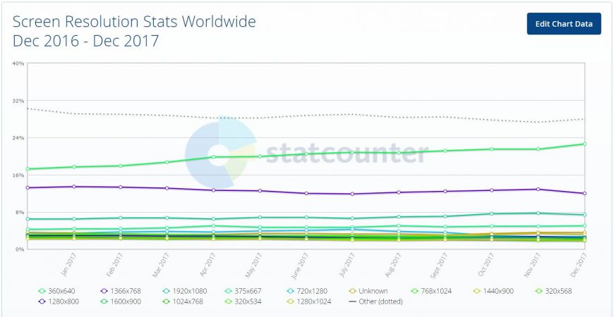
Here are the statistics conducted by Worldwide Screen Resolution, which include the most popular resolutions for websites, both for desktop and mobile versions:
360×640 – 21.54% 1366×768 – 12.85% 1920×1080 – 7.76% 375×667 – 4.94% 1440×900 – 3.32% 1280×800 – 2.67%
So, what is the recommended resolution for a website in 2018?
In order to answer this question, we should take into account Google’s recommendations. Considering that the most popular search engine has the last word when it comes to the success of an online business, your website should be able to provide a positive user experience, no matter the device it is accessed from.
And this is how a web-design issue becomes an SEO issue! If you want your website to rank high on Google, it must be as user-friendly as possible, no matter if the user chooses to access it from a desktop computer, a smartphone or a tablet.
Google started the transition to mobile-first index
Now that Google algorithms are starting to take more and more into account the user-experience on mobile devices, it’s crucial for any online business to have a fast and user-friendly website, especially when it comes to its mobile version. Whoever ignores these recommendations will lose in front of the competitors that have a properly optimized website.
How can I make my website look the same, no matter the device it’s accessed from?
Well, you can’t! Each type of design will look differently, from one device and browser to another, in order to fill the available screen-size.
Instead, you can choose a responsive design for your website, which is also recommended by Google specialists. For example, when your website has a responsive design, you can choose a 1024x768 resolution that can gratiously adjust to a 800x600 resolution when the website is accessed from a smartphone.
According to Google, website owners that already chose a responsive design don’t need to worry about the transition to mobile-first index.
Before deciding upon the right resolution for your website, it’s essential to identify the target-audience of your business and the type of devices they use to access it, in order to create a design that i’s tailored to that audience, which now includes Google.
Furthermore, here are the 3 most important factors that you need to take into account when choosing a resolution for your website:
1) The initial visibility of the web page
Make sure that the most important content on the web page is visible for the visitors, without being necessary to scroll down.
2) The readability of the web page
How easy can the users read the text from different columns, considering the allocated space?
3) The aesthetics of the web page
How are the different visual elements placed on the web page? Do their size and localization match the website’s resolution?
Old recommendations that are still available today
No doubt, it’s good to be updated with the latest trends, but sometimes older recommendations that are still working should be taken into consideration.
According to Jakob Nielsen, a renowned specialist in usability and user-experience, the pages of a website should work properly, no matter the resolution. Here are some of his most important recommendations:
The website's loading speed heavily influences the user experience
Acording to the latest post on Google Webmaster Blog, internet users want to find the answers to their questions as fast as possible. Therefore, the page loading speed is highly important for a website’s visitors. Although the page loading speed is already an important factor for ranking on Google, until now, it was only applied for the desktop version of a website. But Google announced that beginning with July 2018, loading speed will officially become a highly important ranking factor for the mobile version of a website.
Dubbed “speed update” by Google specialists, this algorithm update will affect web pages that are loading too slow. This standard is going to be applied to all websites, no matter the technology that was used to build them.
Get the latest news and updates
By subscribing, you agree to our Privacy Policy
Leave the SEO optimization and online promotion of your business in our hands! With us, you’ll increase organic traffic -> brand awareness -> the number of customers -> sales -> profit! What do you say, shall we make you a personalized SEO offer?


