-
Follow us
-
0723.20.82.90 -
office@iagency.ro 

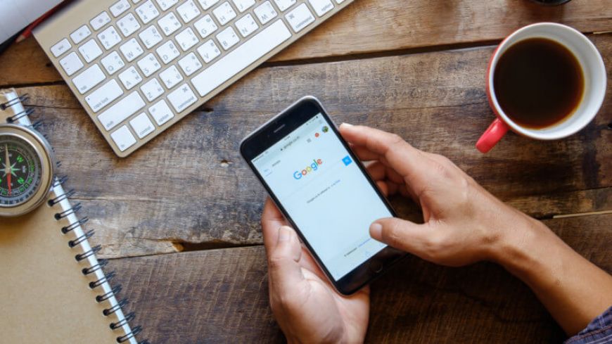
It's more than a year since Google announced the transition to mobile-first index.
According to a research conducted by Stone Temple Consulting at the beginning of 2017, more than 55% of the total traffic on the internet has its source in mobile devices, and this percentage is expected to increase each year from now on.
Noticing that users prefer mobile devices for browsing the internet and online shopping, Google decided to take even more into consideration the user experience on smartphones and tablets. Therefore, in the near future, the websites that are optimized for mobile will have priority on Google's results pages.
If you own an online business, it's only natural to ask yourself the following question: "Is my website ready for the transition to mobile-first index? If not, what should I do?"
Before helping you answer this question, let's see how is your website indexed by Google in the present and what changes does the transition to mobile-first index imply.
What changes will the transition to mobile-first index bring?
At this moment, Google is indexing and ranking your website according to how well optimized is the content of its desktop version. If your website has a separate mobile version, such as m. or mobi, it doesn't have that much of influence on how it ranks in SERP.
Once the mobile-first index will be launched, Google will make a 180 degrees turn and will start to prioritize the mobile version of your website in its algorithms. Therefore, those who will have their websites optimized for mobile devices will definitely have an advantage. For those who didn't get to have their website's optimized for mobile, here are 3 recommendations to be followed in order to be prepared for the transition to mobile-first index:
1) Stay up to date with the latest news on Google Webmaster Central blog
You can never say you are too informed about a subject, so if you want to be updated with the latest news about mobile-first index from a first-hand resource, you should read the latest post on Google Webmaster Central blog.
Briefly, Google's message regarding the transition to mobile-first index focuses on two different scenarios:
i. If your website has a responsive design and its content is one and the same, whether it's accessed from a mobile or desktop device, you don't need to make any changes.
ii. If you have two different versions for your website, one for mobile and one for desktop, and the content is different from one to another, you need to make some changes.
If you find yourself in the second situation, you should take into consideration the following recommendations:
2) Choose a responsive design for your website
Even if you'll probably need to make some financial efforts, now is the perfect time to invest in a responsive design for your website. Having one single version of your website, with one unique URL, that works optimally no matter the device it is accessed from, is advantageous both for users and search engines, as well as for the website administrators.
Here are the major advantages of a website with a responsive design:
- it's much easier for the users to share the content if the website has only one unique URL.
- the site's maintenance is much easier and less time-consuming
- it's much easier for Google's crawlers to index the website, without having to make a correlation between the correspondent versions (desktop/mobile)
- the loading speed of the website increases
3) If your website doesn't have a responsive design and you don't want to invest in that, make sure the most important content is on the mobile version of your website
When Google will implement the mobile-first index, the mobile version of your website will become the primary source for its content. If your website will not have a responsive design, it's important to have the content that you want to rank with on the mobile version.
Here are the most important elements that should be found on both the desktop and the mobile version of your website:
- the most important content (text, images, videos)
- meta tags (meta titles and meta descriptions)
- structured data
Get the latest news and updates
By subscribing, you agree to our Privacy Policy
Leave the SEO optimization and online promotion of your business in our hands! With us, you’ll increase organic traffic -> brand awareness -> the number of customers -> sales -> profit! What do you say, shall we make you a personalized SEO offer?


